Collection MPM
The Brief
MPM stands for Marchés Publics de Montréal, the organization that manages Montréal’s main public markets. It oversees beloved spaces such as Marché Jean-Talon, Marché Atwater, and Marché Maisonneuve. More than just marketplaces, they are vibrant pieces of the city full of color, flavor, and everyday connection. MPM supports local vendors, organizes community events, and promotes fresh, locally grown products, helping keep Montréal’s spirit alive and thriving.
The goal was to create a more approachable packaging that stood out from other cocktail syrups on the market. It was crucial to highlight Quebec-sourced ingredients shaped by local geography and climate, reflect MPM’s values of freshness, and promote organic production. The challenge? To make it bold and eye-catching enough to grab young adults’ attention and inspire them to buy local.
Design Approach
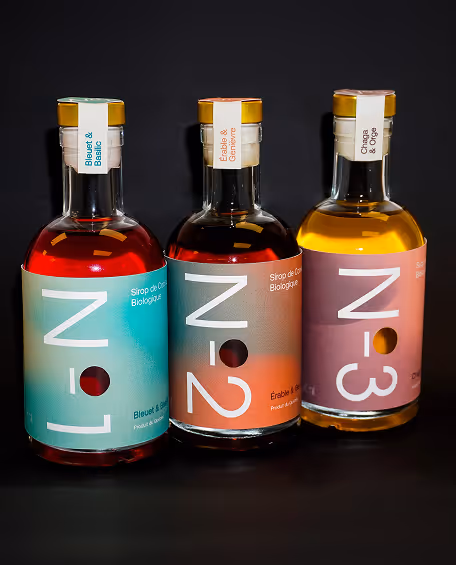
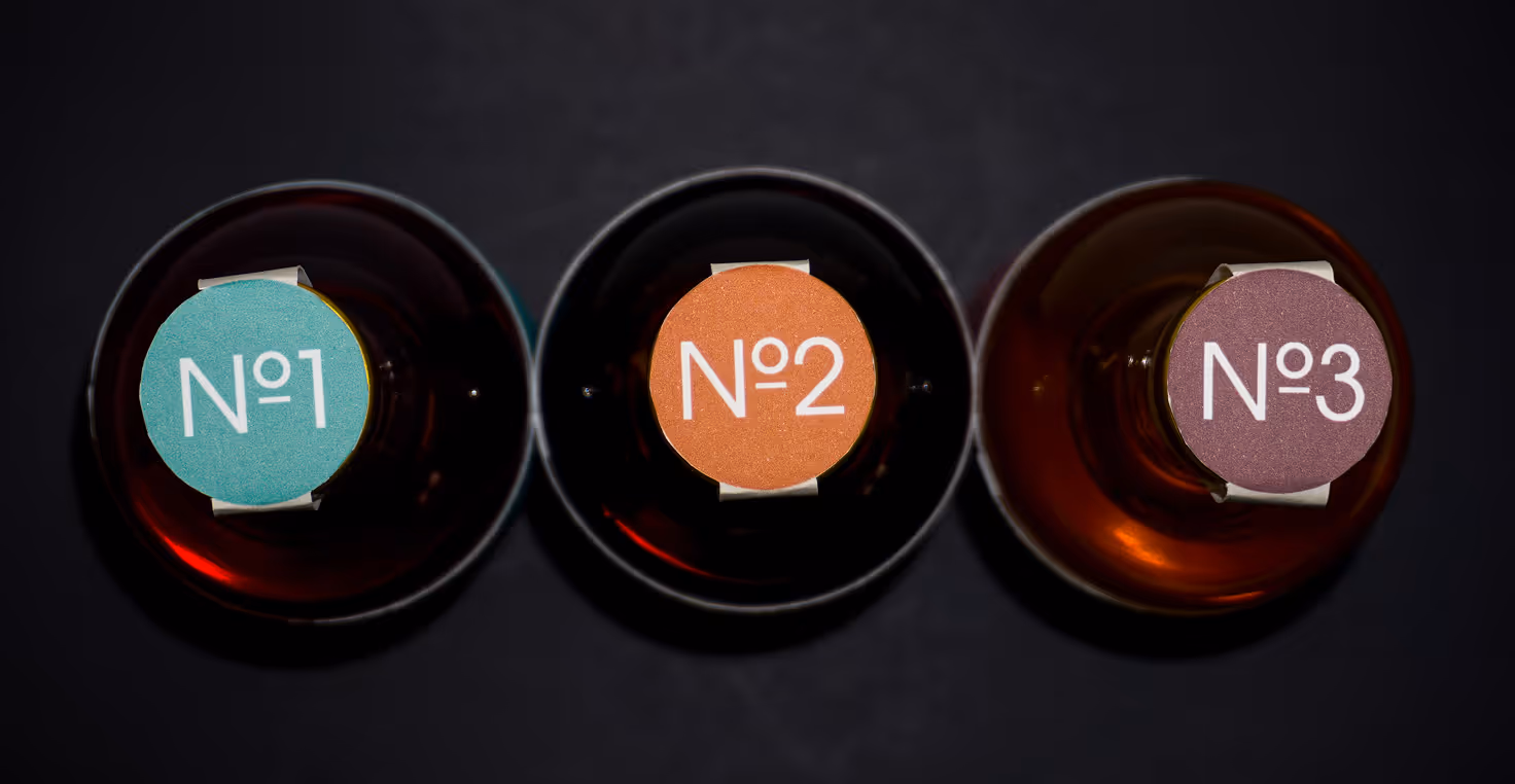
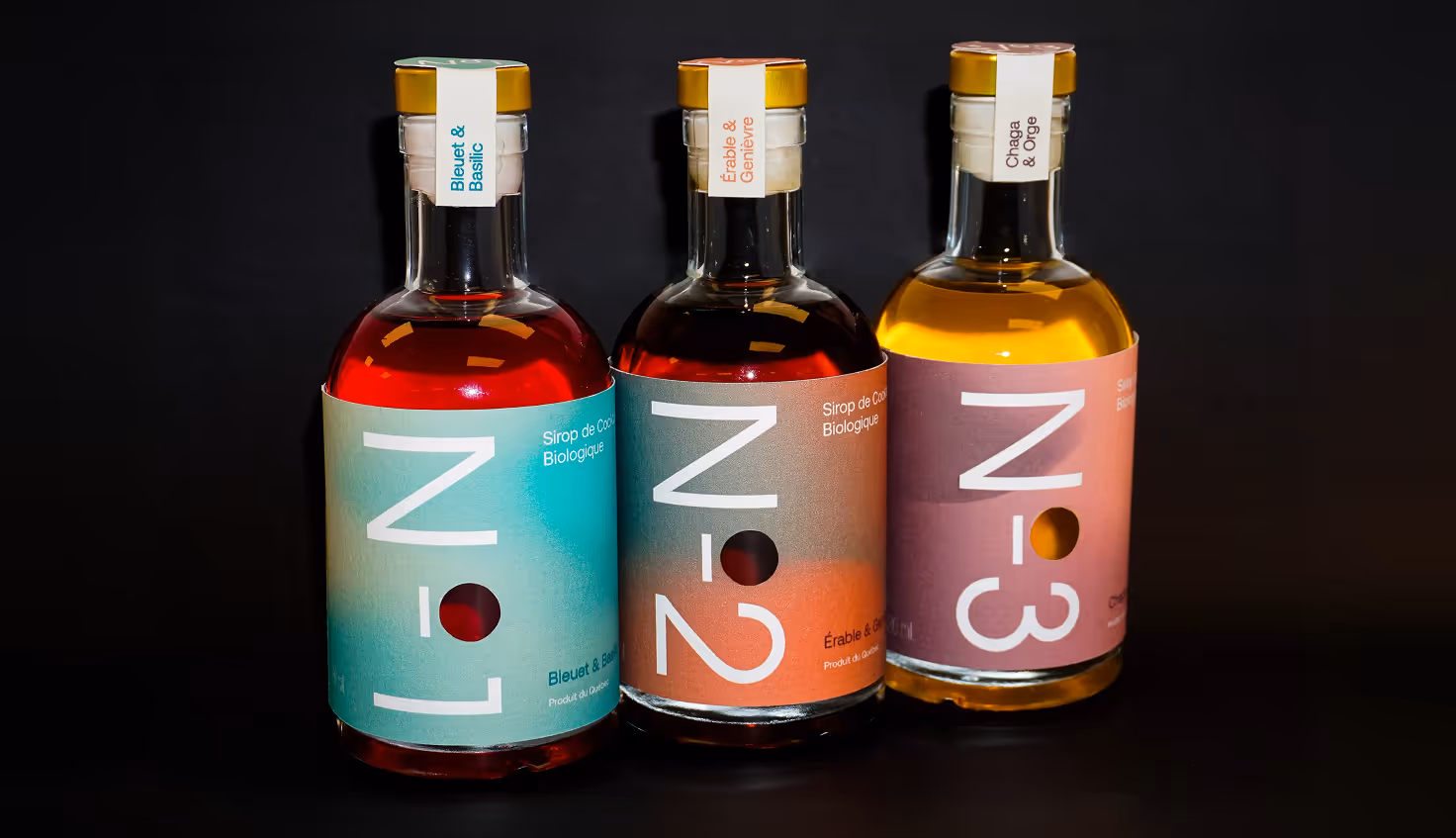
In the early stages of developing the concept, my focus was on howcasing the organic ingredients in each syrup through three flavor pairings: Blueberry & Basil, Maple & Juniper, and Chaga & Orge. My vision was to reflect Quebec’s seasonal shifts while introducing a numbering system (No.1, No.2, No.3) to give the bottles a sleek, collection-style feel.
.avif)
.avif)
Production
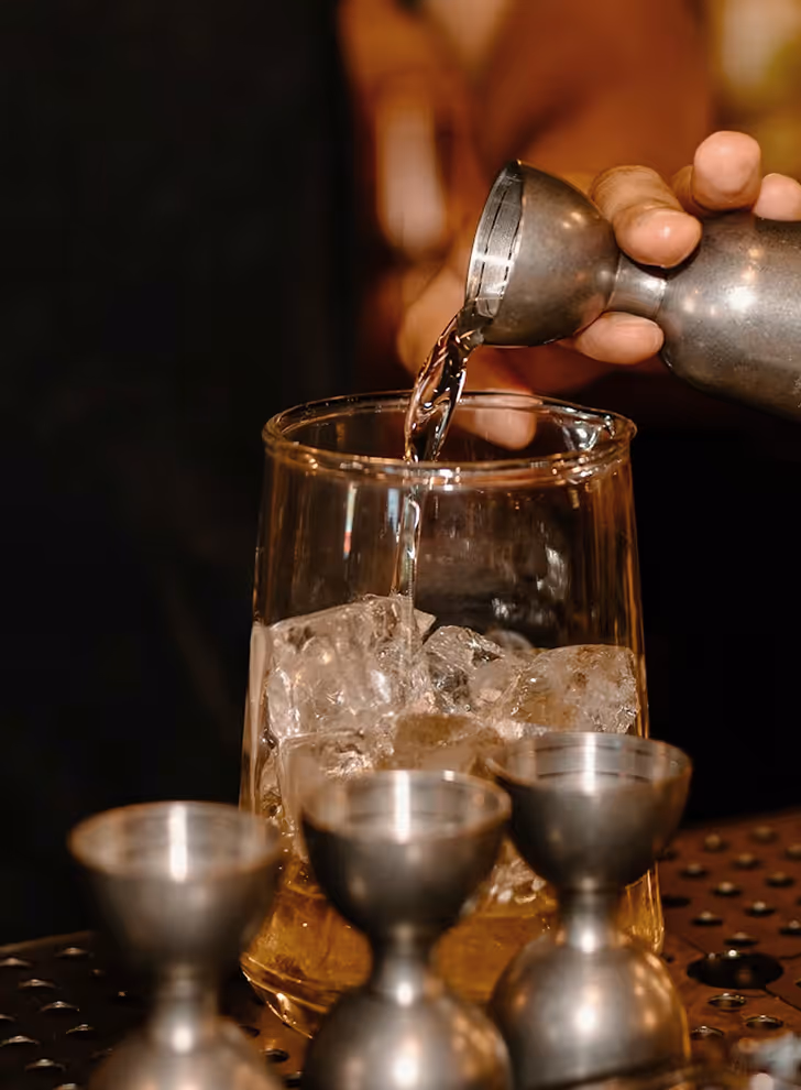
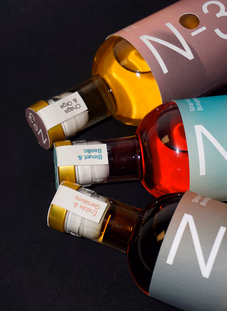
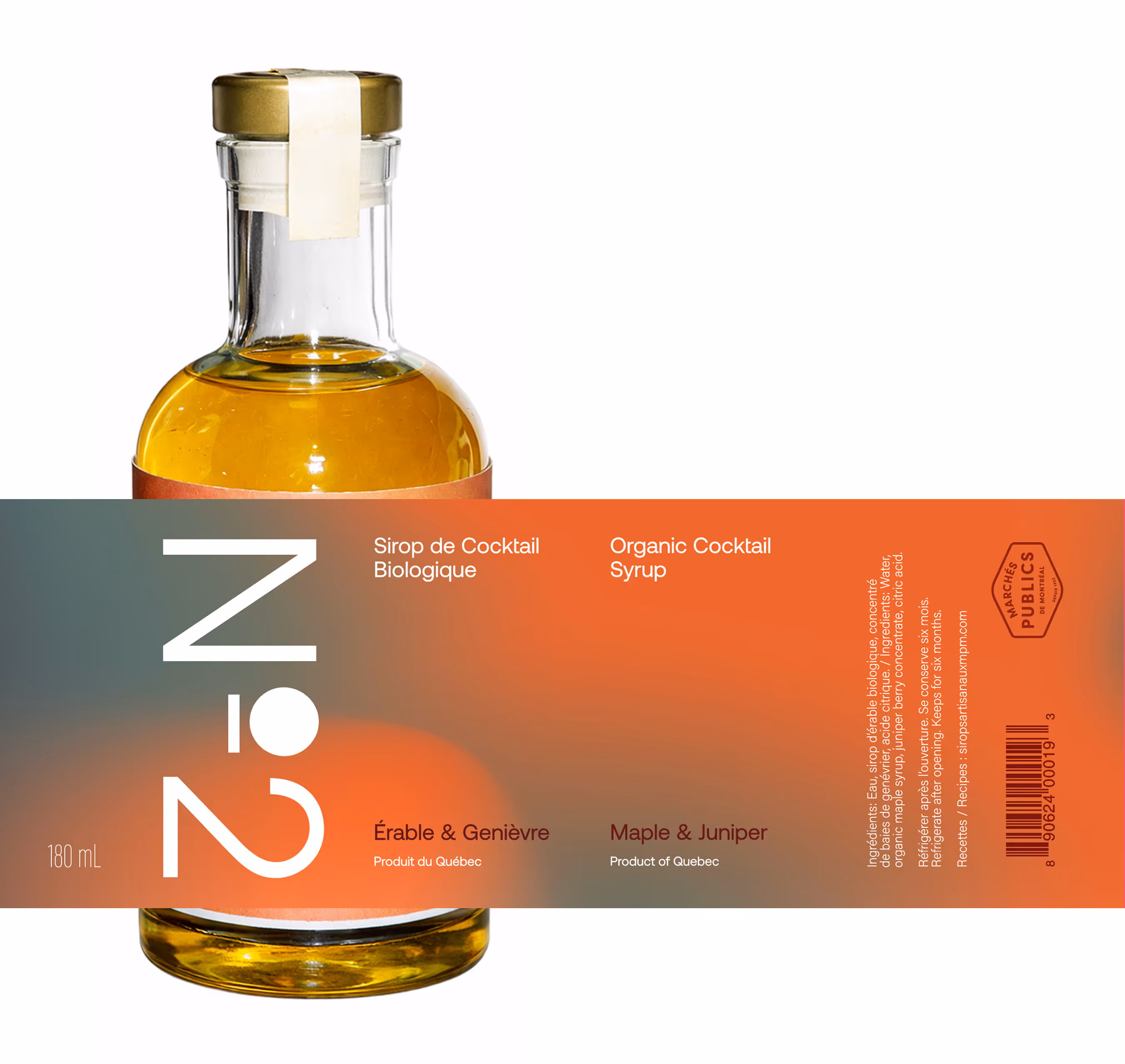
I decided to incorporate a die-cut circle that reveals the syrup beneath, reinforcing transparency and clearly showing the organic contents. I selected a glass bottle for its sustainable, premium quality, pairing it with an airtight cap to preserve freshness. The small-batch format highlights craftsmanship and variety, encouraging people to try multiple flavors or share them as a sweet piece of Quebec's terroir.
For the labels, I chose vibrant gradients inspired by the natural ingredients of each flavor: Blueberry & Basil in cool blue tones, Maple & Juniper in warm orange hues, and Chaga & Orge in rich golden honey shades. I used softened blends to reflect the syrups themselves and paired them with a rounded sans-serif typeface that echoes the shape of the die-cut circle. To strengthen the numbering system, I decided to place each flavor’s dominant color and corresponding number on the cap.