Renaissance
The Brief
Renaissance is a Québec-based nonprofit that supports social and professional integration by funding job training programs through its thrift stores and donation centers. Beyond selling second-hand items, it provides opportunities for individuals facing barriers to employment to gain experience, develop skills, and connect with their community.
Create a new brand identity for Renaissance that reflects their values of sustainability and social mission. Renaissance was looking to refresh the logo with a modern and engaging visual system that elevates the brand’s image. The challenge was to make the design more approachable to young adults while reinforcing that choosing pre-owned can feel intentional, stylish, and aspirational rather than purely practical.
Design Approach
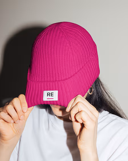
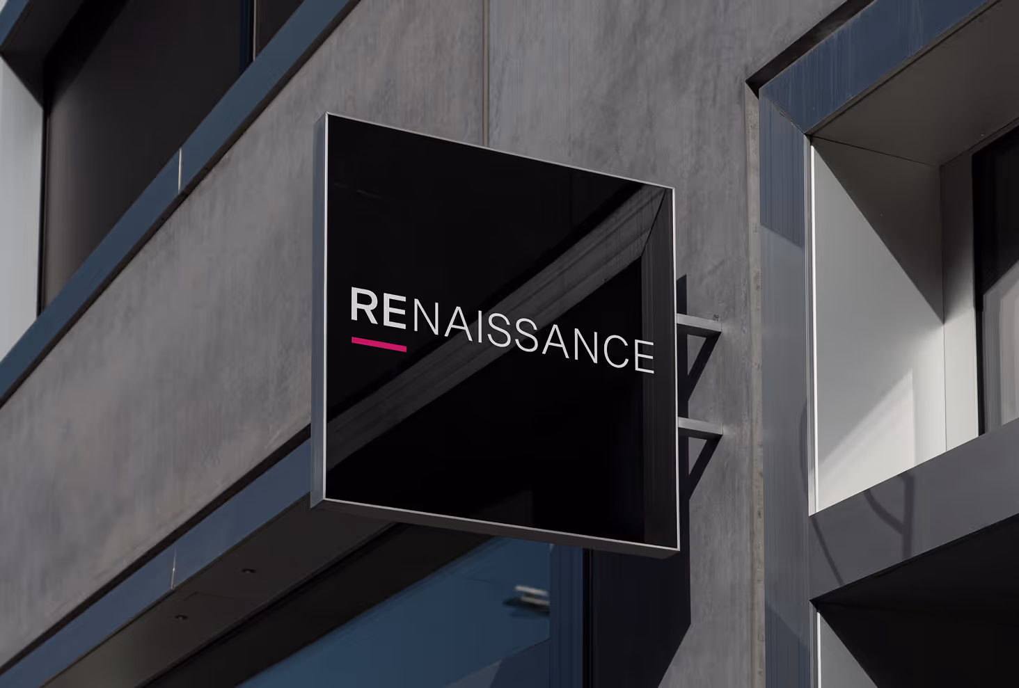
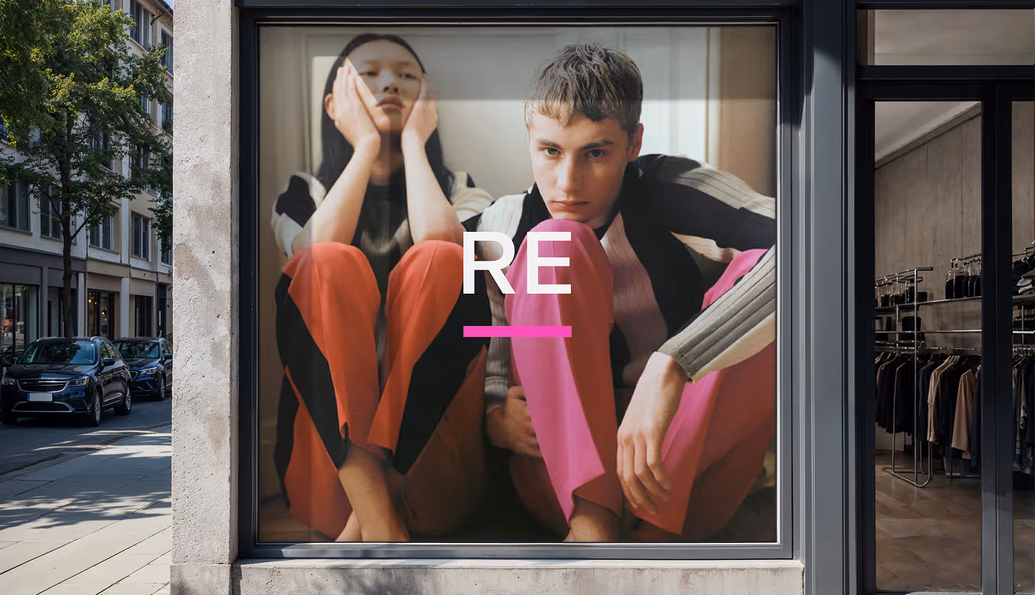
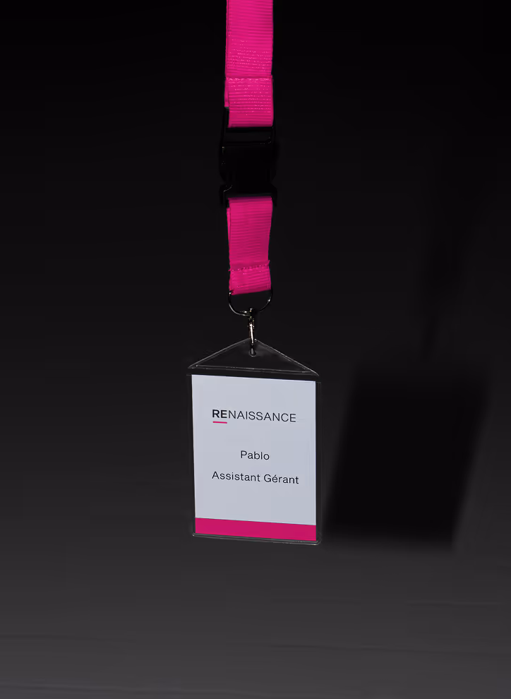
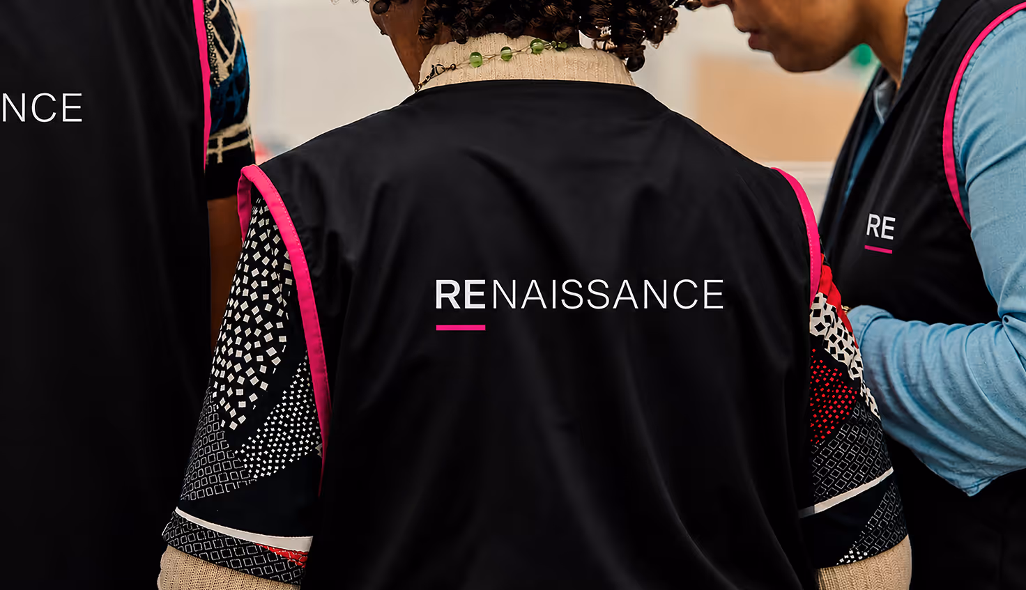
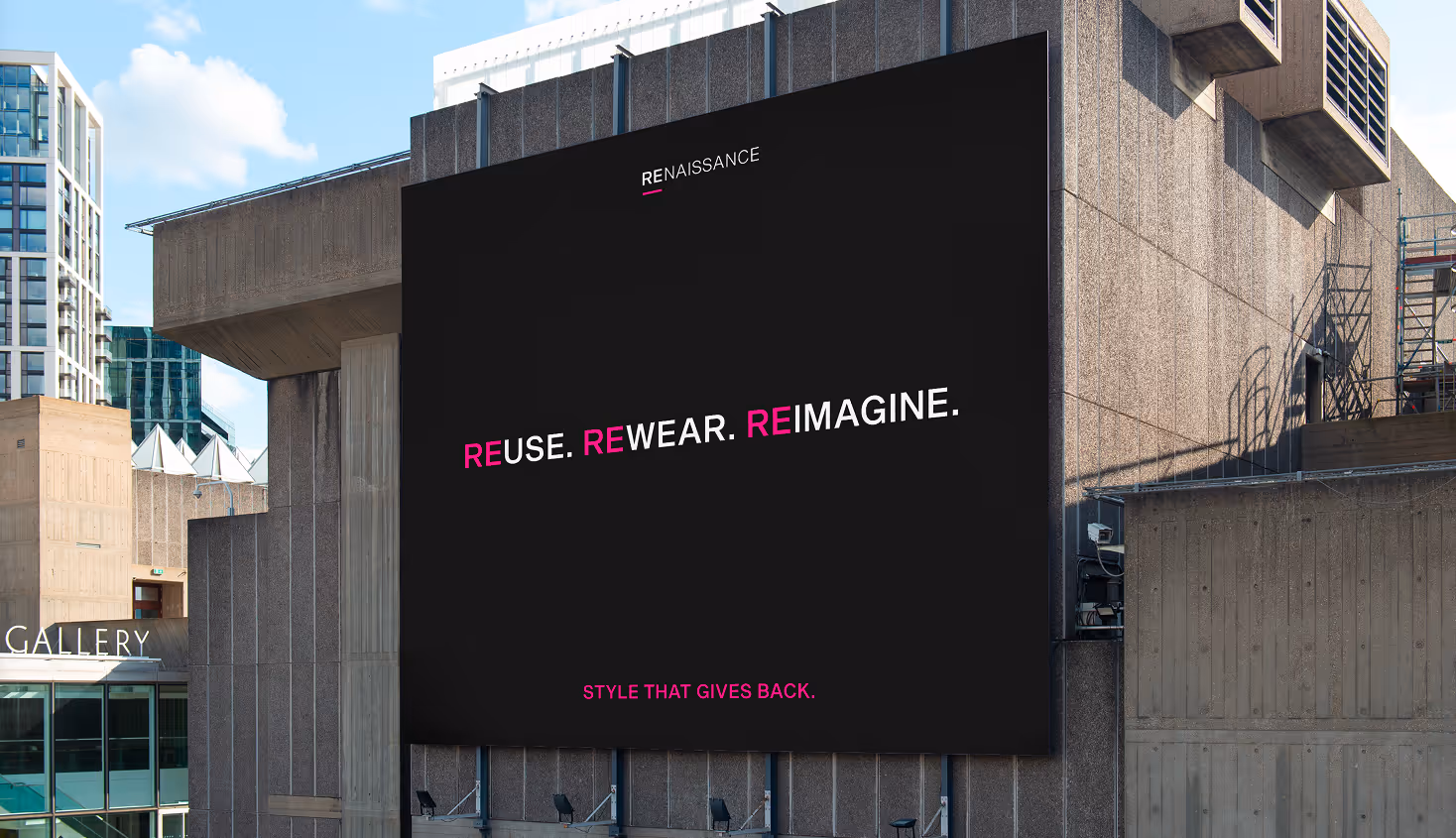
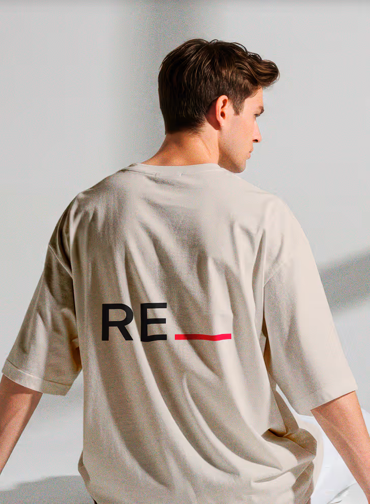
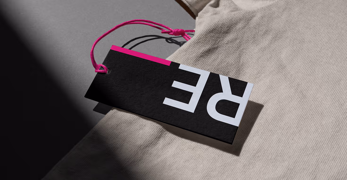
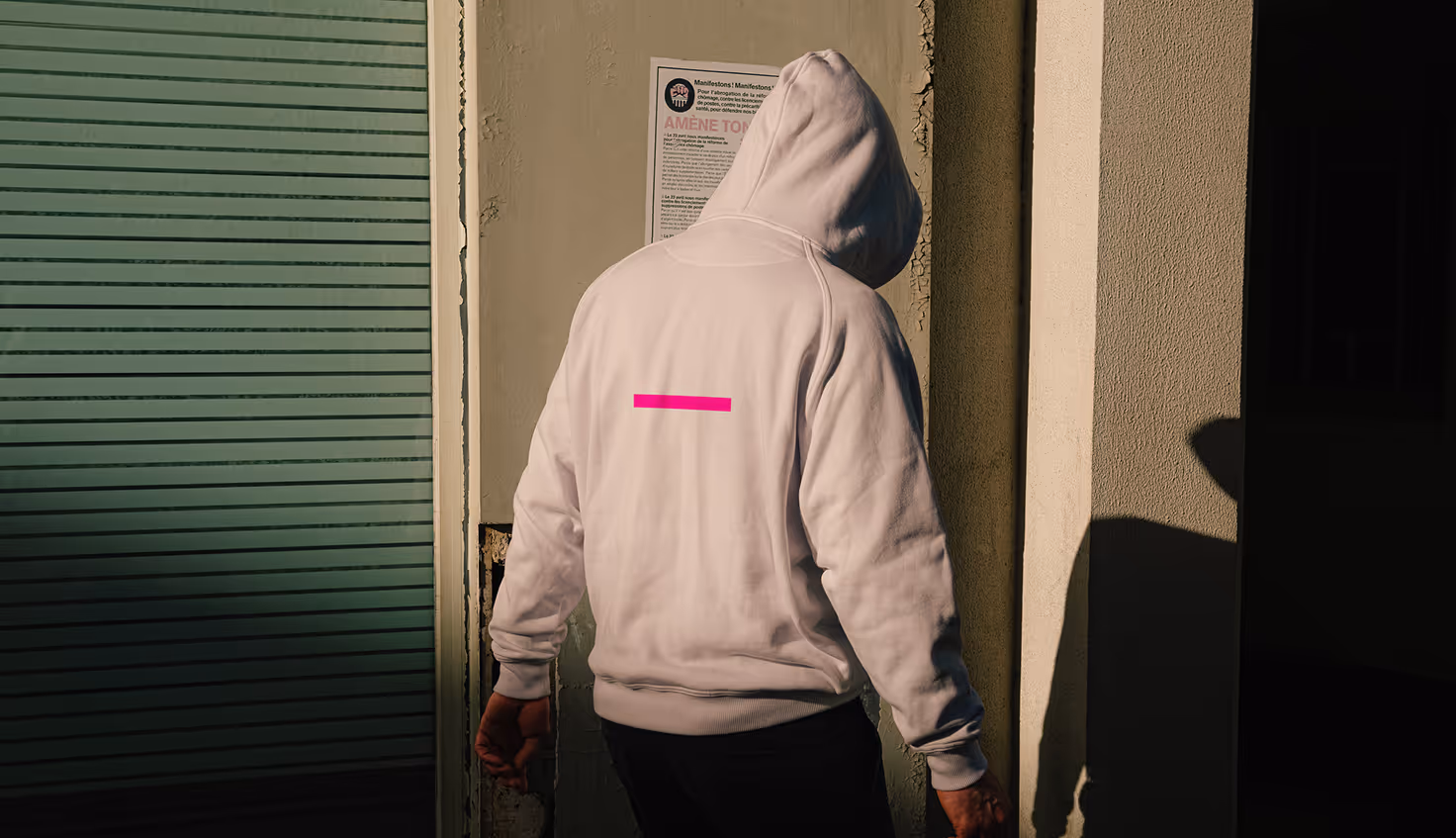
My vision was to create an approachable visual system that reflects Renaissance’s mission of reuse, social and professional reintegration, and community impact, while expressing the idea of repurposing and making something your own. The identity emphasizes the “RE” in Renaissance to highlight the concepts of reuse, repurposing, and reinsertion into the workforce and community. A bright pink stroke underlining the “RE” draws attention to this message, creating a bold visual cue that reinforces the organization’s purpose.
Production
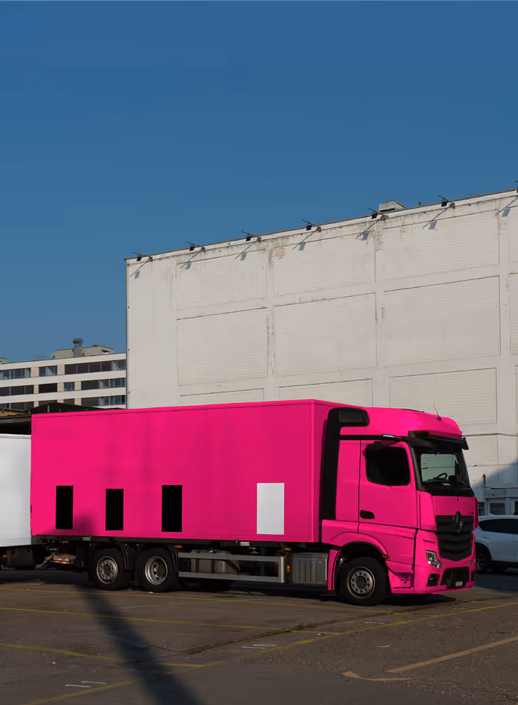
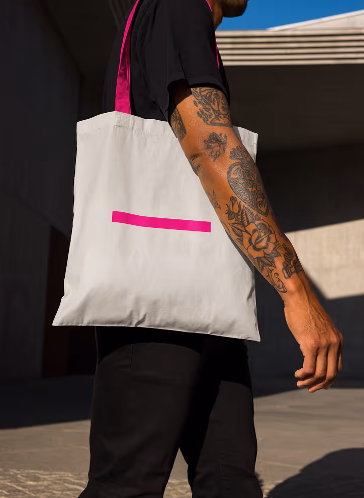
The brand’s visual identity is anchored by the bright pink underline beneath the “RE,” emphasizing repurposing, reusing, and recycling. This detail can grow into a full brand system, applied across different touchpoints by pairing “RE” with other words (reuse, rewear, reimagine) extending the pink stroke into graphic patterns, or using it to resemble stitching. The contrast in type weights adds personality and makes the logo memorable, while the flexibility of the logo and wordmark allows them to appear together or separately, creating a cohesive and recognizable brand language.